From:  The Economic Collapse
 The Economic Collapse
By Michael Snyder, on October 13th, 2014
 Most
people that discuss the "economic collapse" focus on what is coming in
the future. And without a doubt, we are on the verge of some incredibly
hard times. But what often gets neglected is the immense permanent
damage that has been done to the U.S. economy by the long-term economic
collapse that we are already experiencing. In this article I am going
to share with you 12 economic charts that show that we are in much, much
worse shape than we were five or ten years ago. The long-term problems
that are eating away at the foundations of our economy like cancer have
not been fixed. In fact, many of them continue to get even worse year
after year. But because unprecedented levels of government debt and
reckless money printing by the Federal Reserve have bought us a very
short window of relative stability, most Americans don't seem too
concerned about our long-term problems. They seem to have faith that
our "leaders" will be able to find a way to muddle through whatever
challenges are ahead. Hopefully this article will be a wake up call.
The last major wave of the economic collapse did a colossal amount of
damage to our economic foundations, and now the next major wave of the
economic collapse is rapidly approaching.
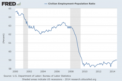
#1 Employment
The mainstream media is constantly telling us about the "employment
recovery" that is happening in the United States, but the truth is that
it is just an illusion. As the chart below demonstrates, just prior to
the last recession about 63 percent of all working age Americans had a
job. During the last wave of the economic collapse, that number dropped
to below 59 percent and stayed there for a very long time. In the past
few months we have finally seen the employment-population ratio tick
back up to 59 percent, but we are still far, far below where we used to
be. To call the tiny little bump at the end of this chart a "recovery"
is really an insult to our intelligence...
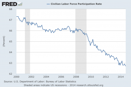
#2 The Labor Force Participation Rate
The percentage of Americans that are either employed or currently
looking for a job started to fall during the last recession and it has
not stopped falling since then. The labor force participation rate has
now fallen to a 36 year low, and this is a sign of a very, very sick
economy...

MORE

No comments:
Post a Comment